top of page
CLIENT
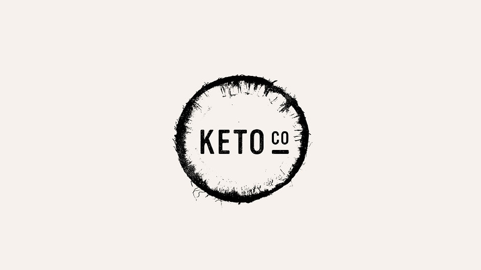
Keto Co.
Logo + Packaging
For Keto Co, the logo concept centers on a simple, striking image — a coconut cut in half — representing natural ingredients and wholesome nutrition. This clean, memorable identity extends through the packaging and website, creating a cohesive brand experience that highlights freshness, health, and convenience.
The packaging design incorporates textural elements inspired by the product’s ingredients, adding a tactile dimension that reinforces the brand’s connection to nature and quality.


bottom of page